 |
| Initial/Rough Wireframe |
Website = 1 large scrolling page with a floating nav at the top to jump between sections of the page.
This is potentially a cool way to format the website because the user can scroll through the entire site and follow a bit of a "story" from Home > About > Schedule/Map > Artworks > (Undecided interactive experience- watch this space). The user gets an initial feel for what the event is about and can then delve deeper as they scroll through. If the user is looking for something specific, however, the navigation is ever-present and easy so they can find the information they need without hassle or excess scrolling.
Having a site this large may present some problems, there may be too much information for this to really be a practical option because of loading times etc. Figuring out how to navigate and view artist pages without making them new pages is also going to require some problem solving.
It will probably be best to just put the sponsors at the very end of the page.
This wireframe is very rough and will need some refinement.
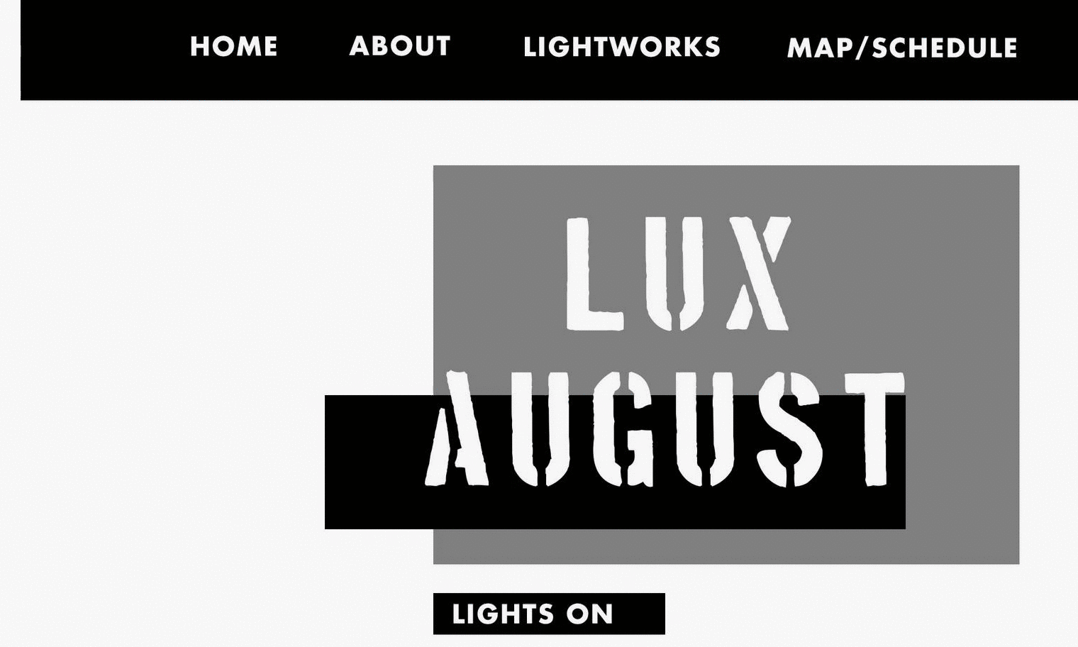 |
| New Wireframe: Homepage |
Working on refining the wireframe here, focussing on each section as if it was its own page for now just to make things a bit simpler, but also shows that the site WILL work as separate pages if we find that the huge scrolling site is too impractical.
Gif pulled from invision to show the fixed header, navigation is always at the top when you need it!
 |
| About Page |
 |
| Map/Schedule: Iteration I |
2 Column layout with map on left and schedule on right.
Buttons underneath map will be used to 'personalise' the map for specific audiences: children, couples, photographers etc.
Concerns= map may need to be bigger, should take priority over the schedule.
 |
| Map/Schedule: Iteration II |
Shifted the map and schedule around so the map has some more breathing room. Possibly makes it easier to compare the schedule because you can have the entire thing on one page rather than having to scroll up and down to see all of the dates.
May need to have separate jump buttons on the nav for map and schedule since the user may be frustrated when they click the map/schedule and can only see the huge map before they scroll down.
More information will probably be required for the events on the schedule beyond the basics that will fit in to the basic schedule. This would require extra pages with more extensive information- which potentially adds to the case against having a one page scrolling site.
 |
| Lightworks/Artist Page |
Possible way to combat this is to have some extra jump links at the top of the page to switch between laneways/waterfront locations. Could also add an option to switch between artist/artwork? I think a search function would be good for those who are looking for a very specific artwork or artist because there are so many works.
 |
| Specific Lightwork Page |
When the user clicks on an artwork it will pop up as this little thing instead of a whole new page. Some people might find it annoying which is a problem and it may make it difficult for someone trying to search for an artist or artwork through google to actually get to this pop up? I'm not sure how that would work or if it could work?
Probably need to refine the wireframe for this some more and include some space for map information, portofolio links, maybe some tags that relate to the personalised map sections?
No comments:
Post a Comment